At Ultimate, we absolutely love getting our teeth stuck into a rebranding project – bringing the whole creative team together to ignite real creativity!
This part of the journey is often where our long-term relationships with clients begin, so the kick-off meetings and workshops spark fantastic conversations. Sometimes we’ve worked together with a client for many years and watched as their business has adapted, grown and evolved; this means in some cases their brand might need to play catch up!
A successful rebrand opens up and strengthens connections with a target audience and authentically reflects who that brand is today, whilst giving them a ripe opportunity to own their space in the future.
With all that being said, let’s delve into our top five favourite rebranding projects here at Ultimate!
5. Seashell
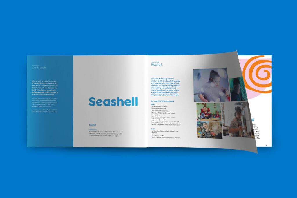
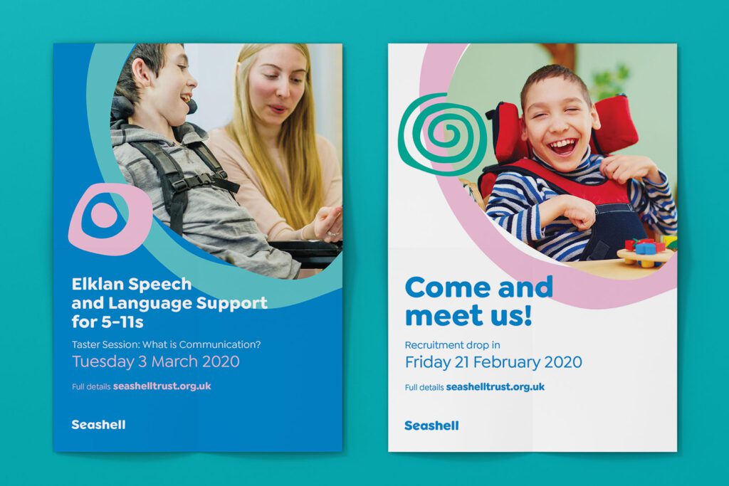
At number 5 is Seashell: “an extraordinary place. For extraordinary people.”
This truly amazing national charity helps children and young adults with the most complex needs and their families to be more independent, and live safe, creative and fulfilling lives with the expertise of specialist support teams.
Formerly known as ‘The Seashell Trust’, the charity rebranded to ‘Seashell’ to embrace a simpler, more memorable identity that reflects everything they do. The new brand combines a soft, caring, and human touch with vibrant, illustrative graphics and colours.
The rebrand is designed to capture energy, the arts, creativity, communication and the vibrant spirit of Seashell that is present across its schools, colleges and residential care. It’s this vibrant spirit that connects every employee, young person, and their families, making Seashell truly unique.
4. The Odd Company
The Odd Company is perfectly described by their line: “a sleep less ordinary”. They create beautiful hand-made mattresses of any size of shape using high-quality traditional methods and the finest natural fillings.
Previously known as the ‘Odd Mattress Company’, this much needed rebrand was designed to open up the brand’s offering as they expanded into a wider range of products. With the ‘Odd Mattress Company’ likely to prove restrictive, Ultimate proposed an evolution to ‘The Odd Company’. The new name retains their unique ‘Odd’ hook, whilst modernising their heritage, and shaking off any threads that might limit the future.
Ultimate set out to create a brand identity that exuded premium sophistication with a touch of quirkiness. We kicked off the creative journey with a fusion of two distinctly different typefaces – creating an unconventional visual style that captured their ‘Odd’ identity whilst complimenting high-end product photography. The little oddities embedded in the logo create an eye-catching brandmark, further amplifying the company’s character.
To enhance the brand’s ‘Odd’ personality, we developed a quirky, playful tone of voice that evolved into a comprehensive ‘Brand Voice’ document. This guide ensures consistency in expressing the brand’s unique character across all platforms and communications.
To complete the transformation, The Odd Company’s website was reimagined to embodied their new brand identity, offering a memorable and captivating experience across all touch points and propelling the brand into the future.

3. BES Group
Number 3 on our list is BES Group, a prime example of a long-standing client relationship with Ultimate. Formerly known as British Engineering Services Group, BES turned to us when they were ready to rebrand, reflecting their significant shift in the industry and celebrating the modern evolution of this historic British business. Repositioned as an inspiring, reliable, and future-ready brand, BES Group is now the “go-to” for customer safety and end-to-end risk management, with a bold new look and global ambitions.
Following an in-depth consultative workshop, Ultimate developed the final creative concept for the brand. This flexible approach focuses on the expertise of BES professionals, emphasising the day-to-day details of what they do best. We crafted the hero message, “your safety, our focus,” which became central to the rebrand.
While the previous brand was dominated by red, the company’s shift toward sustainability and ESG commitments led to the introduction of a more meaningful green and black palette, drawing from the BES Group identity. Graphical assets were also introduced to highlight the key areas: “Testing” “Inspection” and “Certification”.
The rebrand’s true impact was showcased when all these elements came together in standout exhibition graphics at the BIBA Exhibition, where BES Group unveiled their new look.


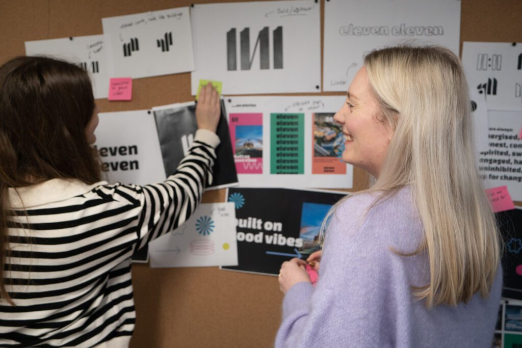
2. eleven eleven
At number 2 is eleven eleven [sic] – an exciting brand to be a part of and a partnership that clicked as soon as we met!
In the field of property development, eleven eleven were housed in a corporate space, but they needed to stand out and reflect the brand they really were! With a strong commitment to social and environmental responsibility and a desire to do things differently, this is a brand with a big personality and a human approach. Their mission is to create positive change for people, places, and the planet, and it was crucial that their brand embodied this message. That’s where the Ultimate team stepped in, and a brand built on “good vibes” was born.
Ultimate developed a new brand identity featuring a unique, contemporary brand mark and the new eleven eleven word mark. We infused the brand with energy and vibrancy to ensure it stands out in a competitive market. The new identity includes dynamic graphics, inspiring messaging, and a tone of voice that exudes positivity.
This rebrand equips eleven eleven to engage their audiences effectively, and provides the flexibility to adapt and grow. Since its launch, the new brand has empowered eleven eleven to penetrate their market and connect with their target audience across platforms – from social media, to marketing collateral, and their website. This rebrand was meant to be!

1. Darwin Escapes
Our number 1 is Darwin Escapes, one of the UK’s fastest-growing leisure brands – with 26 unique and amazing resorts nationwide, each with their own sub brand identity. The Darwin Escapes family means you can experience everything from rural retreats to beachside escapes, action-packed getaways to laid-back lounging, they have a holiday resort for everyone.
The Ultimate approach meant we worked on creating a brand that was full of energy and truly reflects that feeling of excitement you get before a break away. We built upon the idea that everyone is looking for “their very own Darwin Escape”; whether that’s a casual short stay or taking the leap to buy their very own home-away-from-home. This concept covered both holiday-makers and potential owners, and was supported by each of the destinations offering something totally different. Each resort is designed to be the place that brings you a little joy and allows you to get totally lost in the moment.
Imagery and messaging were carefully aligned with the new brand positioning and the concept of “Love Your Escape.” The photography style was candid and spontaneous, capturing moments full of spirit and energy. It feels authentic and inspires you to get outdoors, explore local areas, and make the most of your time away.
An energised colour palette, inspired by different types of getaways — from green forest walks to warm sunny days — complemented the bold new lead colour: Darwin Escapes Purple. The result is a brand that exudes spirit and fosters a deep human connection.
Where did it go next? The success of the rebrand was all in the key decisions made that have allowed for flexibility as this brand evolves. Now instantly recognisable as Darwin Escapes, we created a refreshed and modern brand identity – everything from brand guidelines to developing engaging digital campaigns on social media.
Our team of skilled UI/UX designers and web developers brought the brand to life online by understanding key user motivations and crafting seamless user journeys. Once this brand captures your imagination, you’ll find yourself booking with Darwin Escapes again and again!
Talk to us!
Head here to learn more about our approach to branding, or – simply get in touch.